Checkout Redesign
Group Dynamite
Problem
Conversion rate has experienced a notable 25% decline
The business has observed a significant decrease in conversion rates within the checkout funnel, resulting in a negative impact on e-commerce revenue.
Design Challenge
How can we tackle the conversion drop in the checkout funnel?
By understanding user behaviors and addressing the high bounce rate on the cart, shipping, and payment pages in the Shopaholic funnel, we can understand how can we increase the conversion rate and improve overall customer engagement.
Outcomes
65%
Increase in conversion rate
Sneak Peek
-min%202.png)
Research: How did we actually get there?
How do existing customers interact with the flow?
Analyzed all the checkout current interactions to understand the bounce rate of particular points in the user flow.

What are the customer's pain points while doing checkout?
Conducted usability tests and interviews to identify user pain points and expectations respectively for checkout flow.
-
Customers were using the cart page to add multiple items and removing one after one.
-
Lack of transparency/ smoothness in the checkout process.
-
Users lose track of the items when they move further in the checkout process after confirming the cart.

7
Usability tests

12 Interviews
Key Qualitative Findings

Insufficient Information on Cart Page Aligning with User Journey
Customers visit the cart page multiple times to check prices, but the current pages lack the necessary information tailored to each customer's stage in their journey.

Shift in Customer Behavior
After the COVID-19 pandemic, customers began abandoning items in their shopping carts and instead making purchases from local group dynamite stores.
.png)
Customer Frustrate Due To Usability Issues
Entering shipping addresses, payment card details, and CVV poses challenges for customers.
Key Quantitative Findings
Comparing checkout contribution, performance, and metrics from Y2021/Y2023

1.5/1.12
Conversion rate comparison

-0.7M
Plummet in active users

60%
Bounce rate of the cart & address page

5m/2m
Average session duration reduced by 3 minutes
Checkout Flow (Low fi)
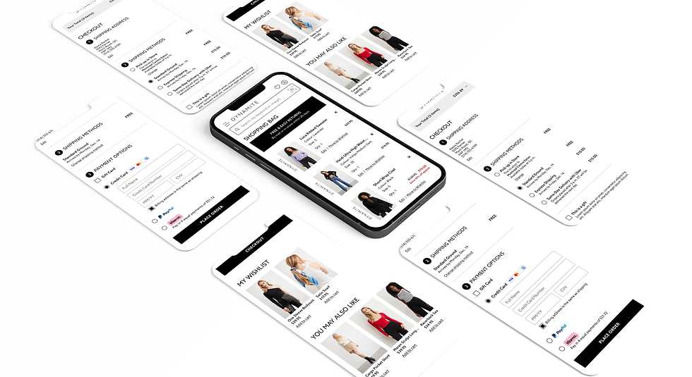
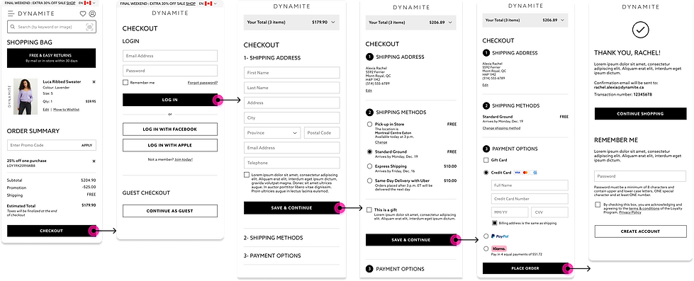
Enhanced Cart Page & Checkout: Simplified, user-friendly design for seamless shopping and efficient order placement.


Cart Page
The shopping cart, or basket is a key step in the online customer journey. It works as a bridge between the product detail page and the checkout.
After analyzing the customer behavior, we built the cart page in a way that customers use it as the basket and find all the essential information in it, and easily purchase or add to their wishlist.
User-Friendly checkout flow
Based on usability findings, we have simplified the pages for adding shipping information, selecting payment methods, and placing orders. Our aim is to enhance user interaction and make the entire process easier for our customers.


A/B and Usability Testing
To assess the impact of design changes, we conducted A/B testing by deploying significant modifications


Checkout: New Customers
The implementation of a one-page checkout significantly reduces page switching, enhances clarity, and effectively reduces the bounce rate.

Checkout: Returning Customers
Existing customers can now complete the process effortlessly with a single click, boosting convenience and efficiency.

Impact: Collaboration and outcome
Through a collaborative effort with Product Management and developers, we ensured that our designs aligned with technical constraints and effectively addressed all edge cases. As a result, we were able to measure the impact of our work over time and continue to provide design operations alongside the development team.
3.9%
Reduced Abandonment Rate
65%
Increased in Conversion Ratefrom Q1 2022 - Q1 2023
After careful analysis, we recognized that the high bounce rate on the cart page should not be considered critical, as users frequently use it to save items for future purchases. This realization prompted us to shift our focus toward improving the wishlist flow to boost conversion rates effectively. Additionally, we observed a significant shift in customer behavior over the course of a year, with many users transitioning from online shopping to in-store purchases. Leveraging these insights, we proposed integrating new features into our app to enhance the overall in-store shopping experience for our customers.
Learnings: What did we learn?
Design solutions align with business and customer needs
One of our most significant challenges was effectively coordinating with a diverse team to meet business requirements and deliver value to users within strict timelines. This experience reinforced the vital importance of teamwork, communication, and thorough consideration of all design scenarios.
Importance to details
Working in a team environment enabled me to learn team dynamics to produce the desired outcome deeply. In addition, I understood that listening is a fine art that provides various insights, for instance, how users' behavior and emotion are influenced by limited features, extra features, and time.

